Project Dashboard Provides Visual Overview of Task Data
Track progress and gain insights to improve workflow
August 29, 2022
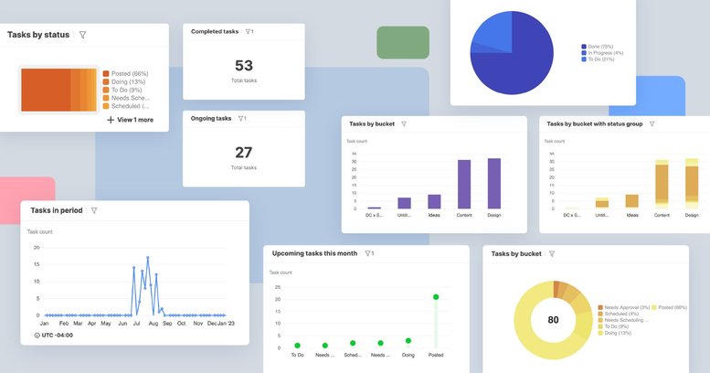
You can now create project dashboards in Swit for individual or multiple projects. With the project dashboard, you’re able to view the status of your projects using a variety of graphs, charts, and data. In this blog post, we will outline the benefits that project dashboard will bring to your team as well as the variety of chart types we offer.
Why Incorporate a Project Dashboard?
The project dashboard helps project managers keep track of overall progress, and helps all users gain insights that can help improve their workflow. We also offer the ability to generate project dashboards for individual, multiple, or all projects.
A manager at a manufacturing company could use a project dashboard to manage the workflow for a production project and ensure maximum efficiency throughout the process. It also allows you to view the workload of everyone on your team, and reshuffle duties if one technician has too much on their plate.
If you’re running a civil engineering company, a project dashboard would be able to show you which stage of the construction process the development project is in, such as laying down brick work, and what percentage of the overall work has been completed, such as leveling and excavation. You can also see which building blueprints still need to be approved when assigning construction workers to the project.
For someone who is a designer at a company, you can create a centralized dashboard to check the status of a logo design you are working on for the website, see the status of graphics that still need to be completed for social media and brochures, and also keep track of upcoming tasks to better manage your workload.
How to Create a Project Dashboard
Project Dashboard Charts
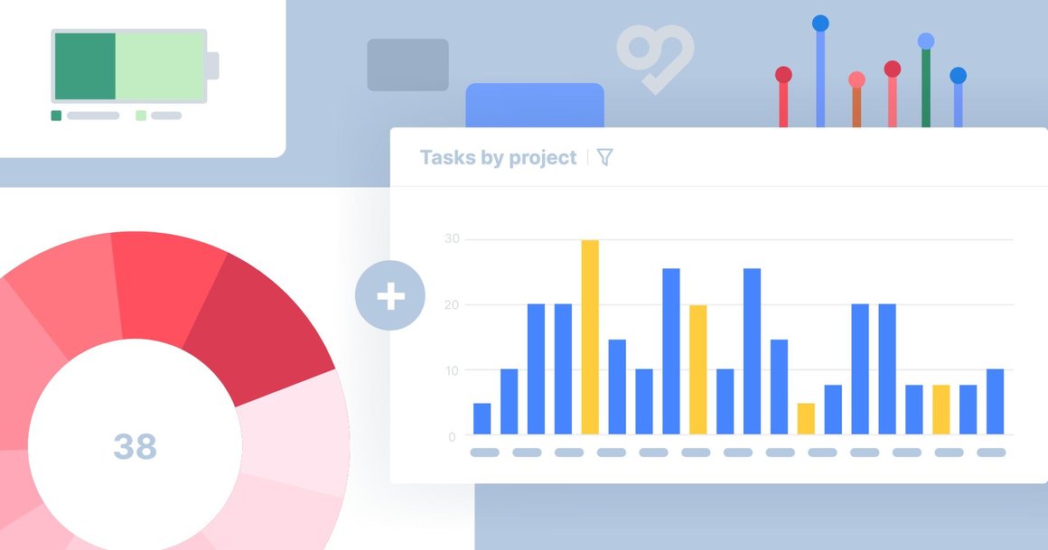
There are eight different charts to choose from within the Project Dashboard:
- Bar - Measures the percentage of tasks someone is working on.
- Lollipop - Shows how many tasks are assigned to an employee, project, status, tag, or priority.
- Stacked Bar - Shows how many tasks are currently in each status per project.
- Donut - Compares the percentage of tasks that are in each project or the workload of your team members, plus the total number of tasks measured in the center of the graph.
- Pie & Battery - Compares how many tasks are in each project or the workload of your team members, while omitting the total number of tasks in the center of the graph.
- Number - Shows the total number of assignees, projects, statuses, tags, or priorities.
- Line - Shows the tasks that have been completed over time. You can group tasks by assignee, priority, project, status, or tag.

You’re able to customize the chart title, chart type, X-axis (Assignee, Project, Status, Tag, Priority), and how your data is sorted. The Y-axis of all created charts will document the task count of the data being measured. Chart customization allows you to organize your data more efficiently, as well as measure what’s most important to you.
For example, if you want to view how many tasks an assignee has, you may do so by customizing the X-axis of your chart to view assignees, your chart type to the bar or lollipop graphs, and the title so you can label what your chart is measuring.
The charts within our project dashboard can benefit your business by calculating how many tasks are within each project, completed tasks, tasks you’re assigned to, tasks that are left to do, which tasks need your immediate attention, and more!
For any business owner, there is a lot that needs to be done in one day! You may need to figure out how to track your budget, edit your website, and manage your employees’ workload with barely any time to spare. The charts within the Swit Project Dashboard can show you at a glance which tasks are prioritized as “High” or “Low,” making it easier to manage your workload across projects.
Project Dashboard Data Lists
You can view the data list of each chart by clicking the three dots on the upper left hand corner and selecting “View Data in List.” From there, you can view information on the data plugged into the chart such as task titles, projects, statuses, assignees, priorities, start date, due date, and last updated. You’re also able to view which tasks each team member is assigned to, when each task is due, which tasks need to be prioritized, which project each task is in, and more with ease.
Let’s say you’re a marketer at an ad agency and a client sends an email asking when an ad you are working on will be completed. You can simply sort the data list by date or name to find the ad they are waiting on and let them know when to expect delivery. You can also manage the other ads you are working on to see if you can better prioritize the work that still needs to be completed on this client’s ad.
We hope that our Project Dashboard will allow your team to organize their workflows more efficiently and analyze tasks with more accuracy. We can provide you with all the tools your team needs to manage their time reliably. Contact us to learn more about our work management solutions.
Ashley Mae Orcutt, Creative Copywriter